|
Dear Readers- As this first quarter comes to a close, I'd like to take this blog post and reflect on my time at SCAD. It has been nothing short of amazing going to school here and learning about something that I am so passionate about. Since being here, I have really tried to take advantage of the opportunities that SCAD provides students. I haven't done everything, but I sure have tried to make the most of my time here. Hope you've enjoyed this glimpse into my life as a bee!!  My first quarter at SCAD...- Attended the Majors and Minors Fair - Joined the furniture design club -Attended SCAD soccer game - Attended a lecture put on by Saya Woolfalk - Saw a film at the Savannah Film Festival (Sun Dogs) In addition to the above list, I have also done the following- -Found a fantastic friend group -Lived with an international student -learned the SCAD bus system... huge accomplishment -Declared my major as Painting with a double minor in Furniture Design and Business - Discovered my love of Ramen Noodles -Acquired an internship at St. Vincents Academy, an all-girl catholic high school, assisting their art program that I will be starting in 2018 - Turned 18 -drank entirely too much coffee         
0 Comments
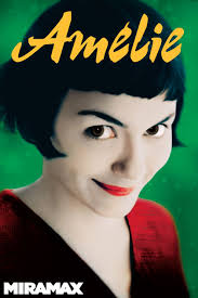
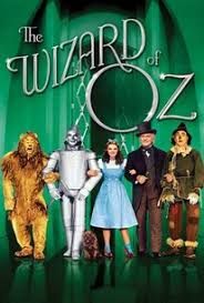
For this project, we were asked to watch and analyze the films "Amelie" and "Wizard of Oz". The main idea of the "Amelie" analysis was to look at the convergent and divergent thinking describing color, lighting and narrative. The focus of the "Wizard of Oz" analysis was to look at the convergent and divergent thinking describing scale, paradox and metaphor. Amelie
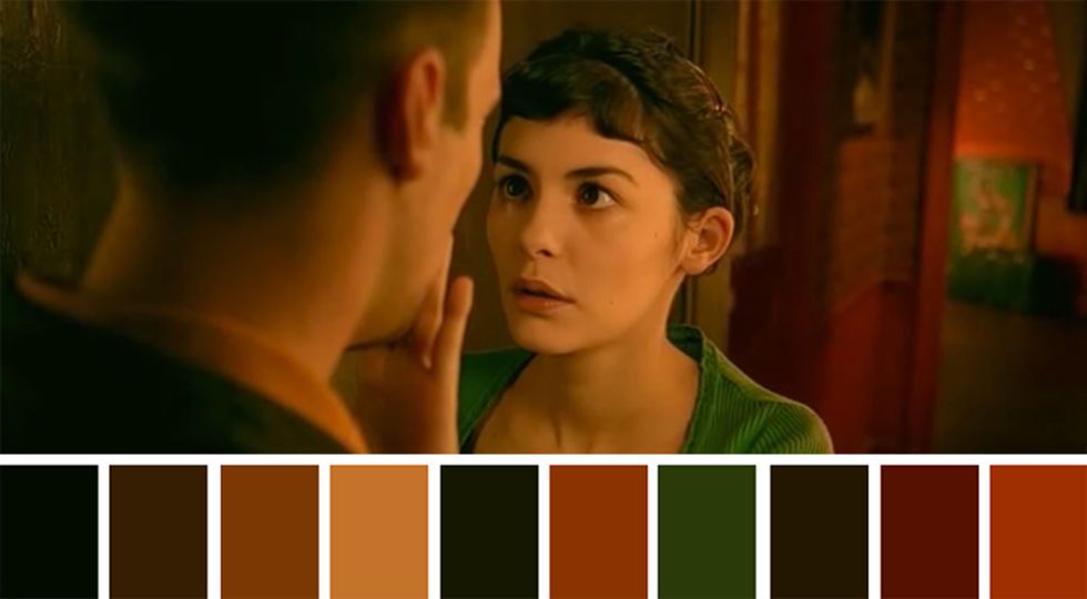
Color AnalysisBelow are a series of color pallets that I have found from the movie. The common use of warm colors can be connected to the constant attempts that Amelie makes to make everyone around her happy- warm colors put represent warmth and happiness. The accents of green in a lot of the scenes are a main representation of hope and nature.
The lighting in Amelie was clearly carefully thought out. The overall lighting was never too bright. it helped each scene seem more realistic and relatable to the viewers. The lights are well placed which if done wrong could easily create a unrealistic scene or shot. The lighting is not too bright or too dim for each scene. NarrativeThe film is told in first person, by Amelie and is a linear progression. The film doesn't have flashbacks looking back on childhood, but instead it follows a timeline and order. By the story unfolding and being told in first person, you feel a sense of connection with the character Amelie. The only parts where Amelie is not narrating is at the beginning and when you are hearing whats going on in Amelie's head. This is a unknown males voice. Where the viewer will feel a connection with Amelie, they will feel a just as strong disconnection with the male narrator. Wizard of Oz
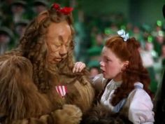
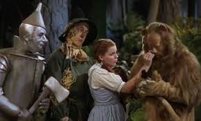
ScaleThe disproportion in the scenery and characters is something I noticed with the scale. Some scenes, the backdrop objects like the houses or the emerald castle looks "larger than life" compared to the rest of the people and things. "Munchkin Land" also shows a large scale difference physically. The munchkins are legit dwarf people making them physically significantly smaller than normal.  ParadoxThere are many examples of paradox in the film. One would be the Paradox of home- Dorthy spends time wishing she could live anywhere but Kansas, but while in Oz she spends the whole time trying to return to Kansas. Also the paradox of what we view as dangerous- Dorthy becomes great friends with a lion. An animal that we would usually see in a cage in the zoo. But the real wicked/dangerous one is the wicked witch of the West- a human. It causes you to ask the question, who are the real monsters in the world?
MetaphorThe children's movie is filled with concepts that make us think deeper into what they actually meant. Watching this movie as now an adult (and 18 year old adult) I am starting to catch the deeper meaning of those things. One would be the friends that Dorthy made- Tin man, scarecrow, lion- I believe its a metaphor for how unlikely friends are hidden everywhere, but also how everyone desires to change (lion wants a heart, scarecrow wants a brain, etc.) as a child it is easy to just cool at that and think "oh cool she's friends with a lion" and that be the end of it, but looking at it now you understand. Another metaphor would be the wizard. How he was so idolized in Oz and then come to find out he's just a guy behind a control curtain. Trust me, as a child I was highly let down by this, but I couldn't really tell why. Looking back now, I can tell that it represents those that we as humans idolize- how we put them on a pedi stool to be let down by them sometimes. The metaphor of the yellow brick road being life is also an example- how Dorthy goes on this journey of highs and lows with struggles and triumphs is much like how life is.
For a quarter project, we were each assigned a designer and also asked to create a 10-15 minute presentation on that designer. My designer was an architect named Elizabeth Diller. Click her name to see my presentation! 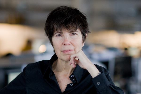 Golden Ratio- Some twentieth-century artists and architects, including Le Corbusier and Dalí, have proportioned their works to approximate the golden ratio—especially in the form of the golden rectangle, in which the ratio of the longer side to the shorter is the golden ratio—believing this proportion to be aesthetically pleasing. The golden ratio appears in some patterns in nature, including the spiral arrangement of leaves and other plant parts. For this project we were told to find examples of the golden ratio. In the definition above you learned that the golden ratio is basically just what makes an image the most visually satisfying. I found it to be interesting that after research, we as humans apply the golden ratio without even knowing it. In class we watched a video to learn more about what it was and how it came about- click the button to watch a video I found to learn more. My ApplicationLooking for applications of the golden ratio, my first thought was to look at advertisements. My favorite purse designer is Kate Spade so I decided to look at some of her ads to see if they fit the golden ratio. Needless to say, I was not disappointed. Her colorful and chic designs and advertisements are not the only things that make them nice to look at, but also the fact that they fit the golden ratio. Below are the ads with the golden ratio photoshopped on top off them. When looking, notice how they all fit into the shell looking shape, how none of them are completely centered, and how they all come to the focal point in the middle. 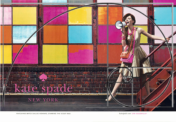 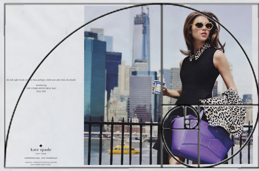 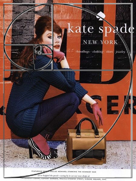 Click here to shop Kate Spade Looking closer at the color in each of the ads can give a different feel. Colors can cause a viewer to see what they are looking at in a different light. By taking the 3rd ad, I put a filter on each of them in photoshop in the primary colors of red, yellow and blue to change the feeling. Warm colors can be connected to a feeling of anger or happiness whereas the cool colors can be connected to sadness or a calming feeling.
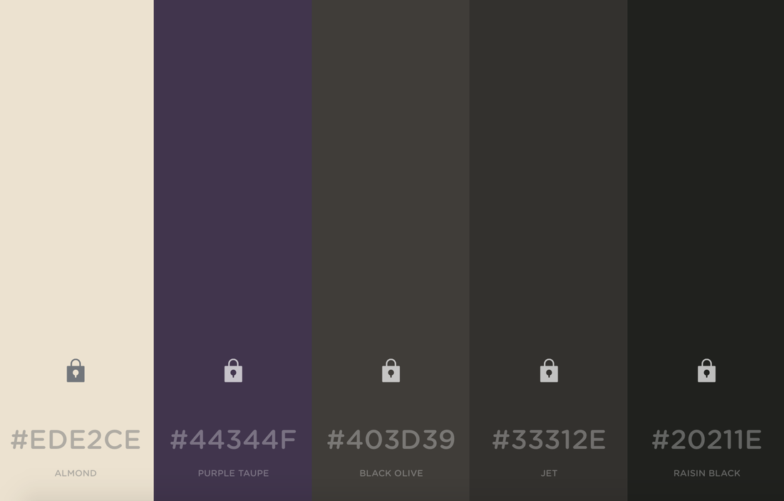
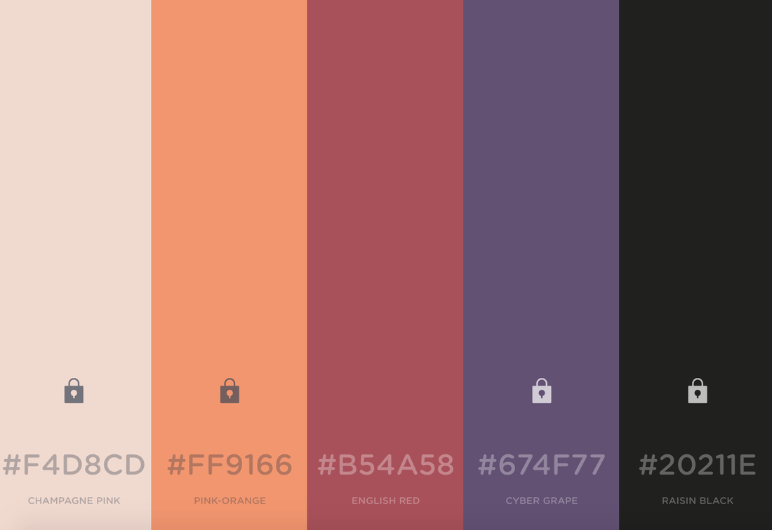
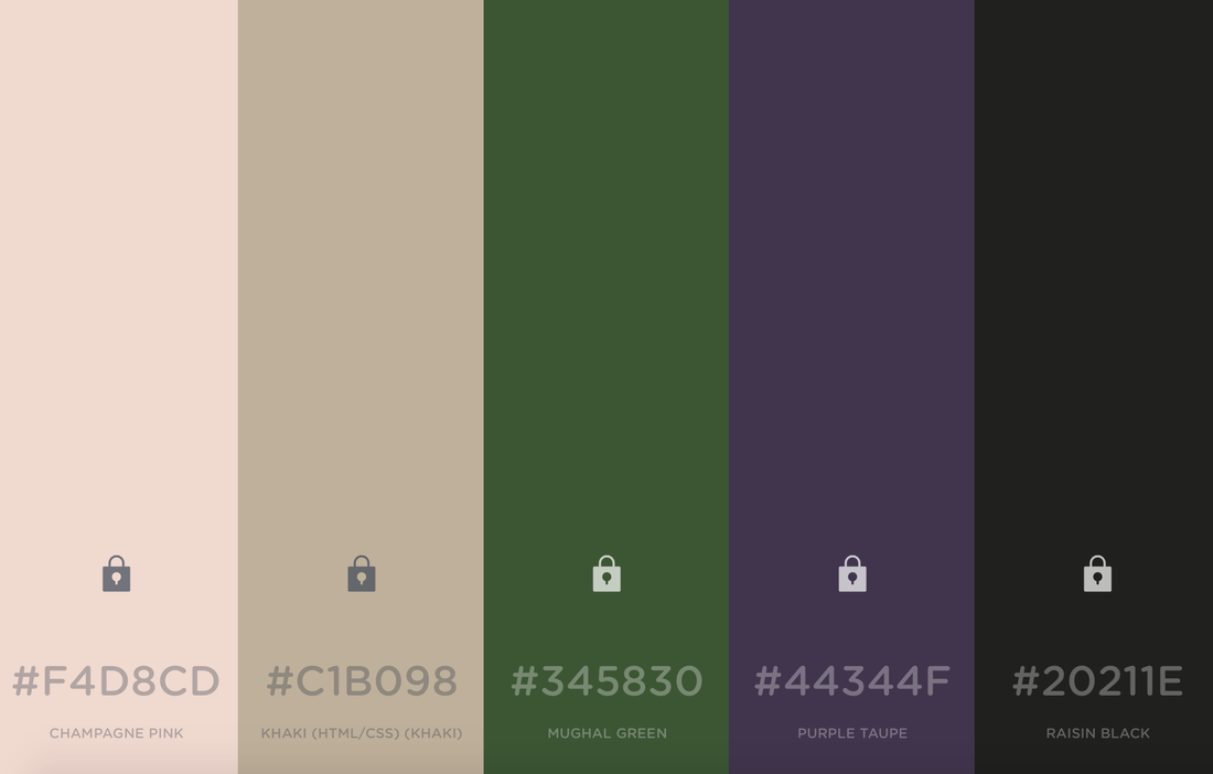
Durning a class discussion, we talked about the importance of branding. Through branding, you show off your personal style and aesthetic. Apart of both of those are the influences of your color palette. As I was thinking of my personal color palette, I realized that I like both wild bright colors, but I also like my nutrals and having a style that is seen as "clean cut". For my blog, I would say I have more of that "clean cut" look. below are images from my blog.
After looking at my blog, I used the website colors.co which is a site that used to create color palettes. looking at these specific screenshots of my blog, I chose colors to create a palette. Below you will see the palette in the same spot as the screenshot that it corresponds with.
The palettes, I believe, fit nicely together. you see common colors in them, but you also see different ones. I believe that these colors also represent me quite well. They all involve purple- my favorite- and a variety of other warms and cools.
|
Archives
November 2017
Categories |


 RSS Feed
