|
Class 5- music geometry- In its form, rhythm and metre, the pitches of its notes (intervals) and the tempo of its pulse music can be related to the mathematical measurement of time and frequency, offering ready analogies in geometry." In class we were introduced to this project by first watching a video on the Parthenon Frieze, A high- relief marble sculpture done between 443- 438 B.C. This sculpture is not only incredibly detailed and beautiful, but it also involves musical geometry. Consisting of 378 figures and 245 animals, it was created to depict a procession in honor of the Goddess, Athena's birthday. Each of the heads that are in the sculpture match up with a music note in a song. This lead us into our next project essentially doing the same thing. Below are photos of the Parthenon Frieze--   Process and PlanThe first task was to pick a song- the song I chose was, "The Man Who Cant Be Moved" by The Script. It is one of my all time favorite songs and I know it very well. I love the story behind it and I knew I could do a lot with it. Its a song about the love and perseverance of a man waiting on a woman he is in love with in the spot that they first met. I was also inspired by the music video, how it was shot mostly outside, but it wasn't focused on the aspect that he was essentially "camping" on the corner waiting on this girl. It was almost viewed as if he was homeless as opposed to just waiting. I found inspiration in what the music video lacked.- click the button below to watch it!  After picking my song and looking at the lyrics, I picked out a phrase that I liked that I thought captured the song. The phrase I chose was, "I'm not gonna move". I then found the sheet music and looked specifically at the notes for "I'm not gonna move" to use for my design. below is a section of the sheet music and also my specific line.   For my project I decided to design a tent made out of cardboard to capture the essence of the man being on the corner with the cardboard sign camping. The design on the outside of the tent is connected with the notes from the phrase, "I'm not gonna move". Using scraps from cardboard boxes leftover from my move in day, I was able to construct a tent. Before I put all the pieces together, I first designed the outside of the tent- the front and back walls are done by peeling off the first layer of the cardboard. I wanted it to be significantly different then the sides of the tent. It gave it a rustic feel. I then took the chords from the phrase "I'm not gonna move" and used them to be the designs on the sides of the tent. Where the gold polka dots are, match up with the chords. I thought it was important to design the pattern in a modern way- making it something almost glamorous that you wouldn't usually see on a camping tent. Below are the pictures of my final product. Enjoy! 
0 Comments
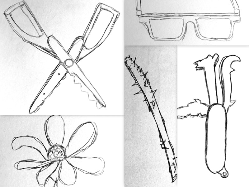
Class 4- In class exercise In class we were asked to spend the full 2 and a half hours doing contour line sketches of 25 different objects. Some objects were man made and some were found in nature. It was important that we had a variety of objects that we were drawing. Our inspiration for this assignments was Andy Warhol's contour line drawings. Andy Warhol was an American artist born on August 6, 1928. As a child, Andy became interested and quite good at drawing. Soon after picking up drawing, he picked up photography. In his later life, as a young adult, he moved to New York City to pursue his dream as a commercial artist. His contour line drawings became very popular and were very simple. Using mostly a ball point, Andy claimed that he was constantly erasing and redoing sections of his pieces. He wanted to just simply be free and not have to worry about fixing or editing. The freeness of the contour line drawings is what inspired our class. By doing 25 objects in 2 and a half hours, you didn't really have time to be precise and really focus on detail. In Andy Warhol's contour line drawing examples below, you will clearly see the simplicity in the pieces, but you will also be able to see how interesting they truly turned out to be. My Contour Line DrawingsI found this line exercise to be relaxing, but I am also used to erasing and editing my pieces. It was hard to not necessarily focus on the individual small details, but to instead look at the drawing as a whole. The following images are my 25 contour line drawings.
After completing the contour line drawings, we were told to take one and turn it into something. I chose to use the toothbrush and make a logo for my dentist (Patty V. Thompson DMD). I drew the logo, but it can also be easily digitalized and printed on scrubs or stationary.  Class 3 The study of point Point- Is a basic mark, such as a dot, a pixel, or a brush stroke. A study on point point - noun, verb give force or emphasis to (words or actions) a basic mark, such as a dot, pixel, or brushstroke The assignment for this visual design analysis was to take about 50 photographs of examples of "point," pick out the best images, and create a unified composition consisting of 20 two-inch squares. Each student had the freedom of interpretation as to what type of point to find and photograph but the end result should to be varied, unified, balanced, and interesting. Focus on some of the most important principles and elements of two-dimensional design: point, shape, texture, color unity, variety, proportion This design challenge also acknowledges the six aspects of Gestalt- grouping, containment, repetition, proximity, continuity, and closure. I really enjoyed doing this project. For my point photographs, I chose to walk around the city of Savannah to find my points. I am not from here and I find Savannah to be a very interesting place. Not only was I able to explore the city, but I constantly found myself running into SCAD students that helped me on my search. The process- After capturing my 50 photos, I loaded them onto my computer. Looking at them as a whole group, I was immediately able to weed out the weak point photos. I then was able to make my way down to the 20 photographs that would make up my digital design piece. Below you will see the 50 original photos, the moving process and the 20 photos that remained. 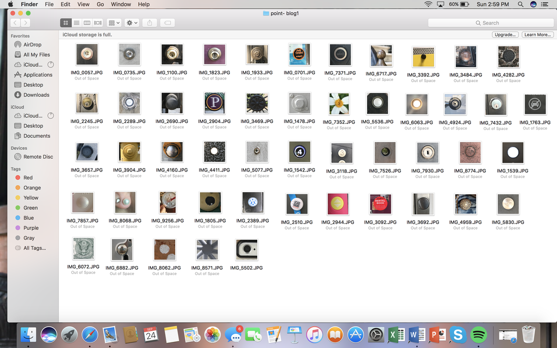  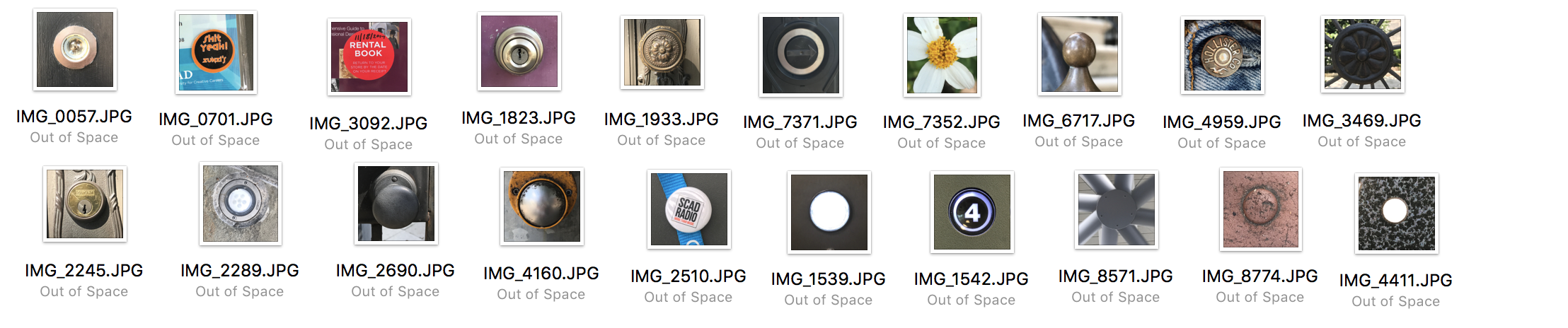 After narrowing down the photos to 20, I used an app called "CollageFactory Free" to put them in a grid system. From there, I began moving the images around to assure that they were in places that not only enhanced the photograph and the others around it, but also contributed to the overall look of the piece. Finally, after all the photos were in their designated spots I saved the collage and converted it into black and white. Below you will see the app I used, the collaged images and the final products of the collages in black and white.   Final Products  Class 2 Working with lines, shapes, textures and value. Line- one of the simplest and most versatile elements of design. A line can be described as... - A point in motion - A series of adjacent points - A connection between points - An implied connection between points Shape- A flat, inclosed area. You can create shapes by... - Enclosing an area within a contentious line - Surrounding an area with other shapes - Filling an area with solid color or texture - Filling an area with broken color or texture Texture- The surface quality of a 2 dimensional shape or a 3 dimensional volume Design- The arrangement or pattern of elements or features of an artistic or decorative work. This was an in class visual design analysis that focused on lines, shapes, textures and design. Working in our mixed media pads, we created 4 columns and 4 rows of spaces. Each row contained a specific design that gradually became more complex as you went down the column. The circle at the bottom of each column contains the finished design. Each student was encouraged to be creative; to let other designs, good and bad, inspire them. In my personal designs, I really focused on making the finished product something that was visually interesting. Something that I wouldn't mind looking at on a business card or a logo. Enjoy!  Class 1 Mapping of our class As a pre-quarter assignment, we were told to write a 3 page paper on what defines us, why we chose SCAD and what programs we were interested in. When we arrived in class, we were told to read the information in our paper to our neighbor who would then be the one to introduce us to the class. This activity allowed us to get to know not just each other, but our whole class. Meet my Design 100 class! Click on their names to view their blogs! Samantha Williams- Tucson, AZ Kennedy Scott- Louisville, KY Natalie Welch- Franklin, TN Morgan Shock- Wheeling, WV Katlin Shafran- Schenectady, NY Mallika Patel- Ahmedabad Gujarat India Jared Allen- Glenelg, MD Dean Liu Yuan- Canton China Alexa Baroncelli- Sarasota, FL Gabriela Serpa- Ponce, Puerto Rico Rose Logan- Orange Park, FL Thomas Hill- Augusta, GA Jermaine Jones- Rocky Mount, NC Elle O'Keefe- Reston, VA Michelle Hubner- Fallston, MD Micha Stuart- Peachtree City, GA Chris Gibbs- Griffin, GA Kyle Reynolds- Long Island, NY Mila Lazarevic- Belgrade Serbia  |
Archives
November 2017
Categories |


 RSS Feed
